product design
Accelo Reports Screen
The existing Accelo Reporting page posed significant usability challenges. The images didn't represent the data and there was no way to filter or access frequently used reports. This presented a prime opportunity to enhance this heavily utilised area and improve user experience.
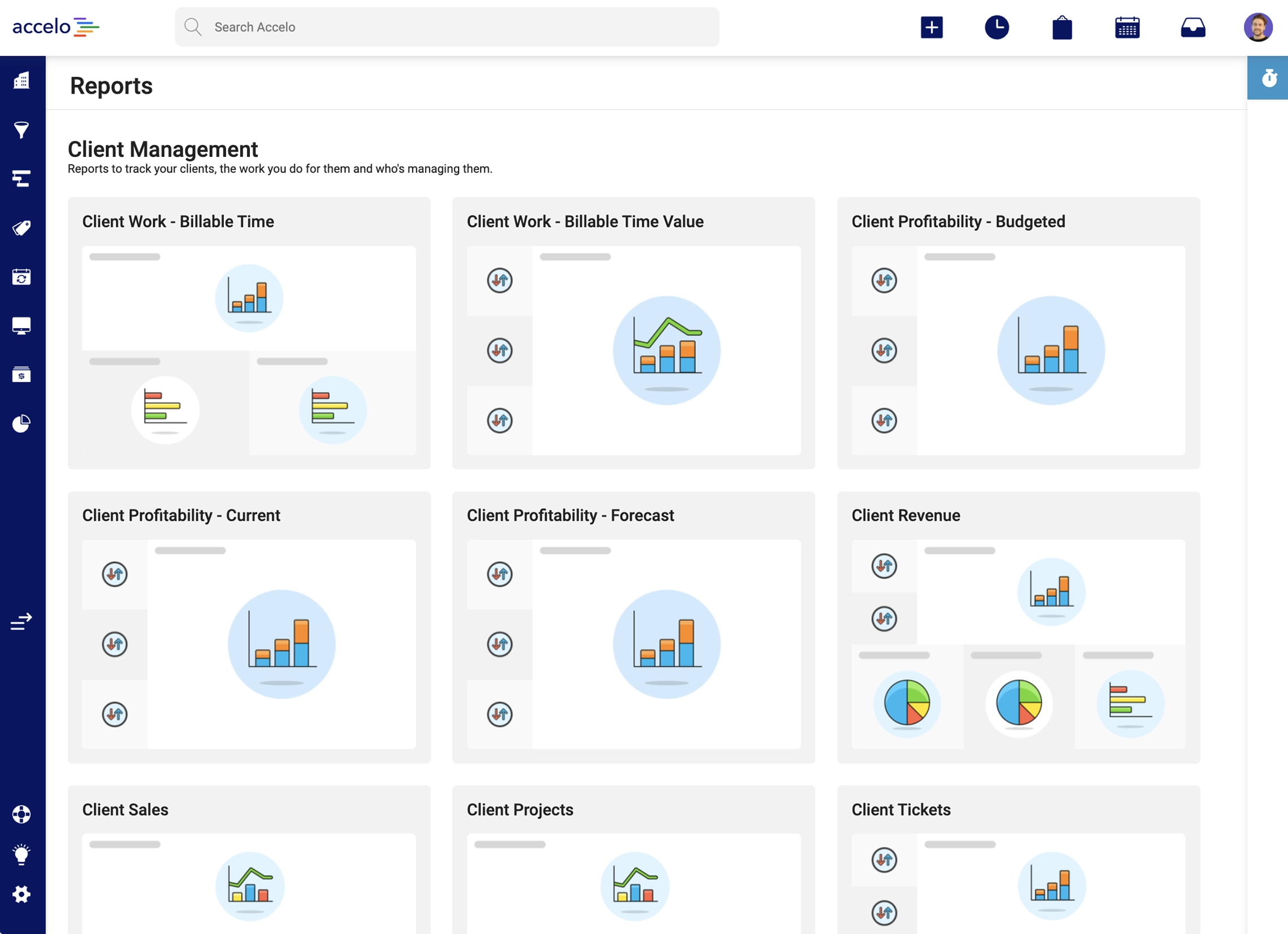
The existing Accelo Reporting page. Dated design, missing functionality and hard to use
The Problem
The Accelo Product team aimed to identify high-impact areas for improvement that required minimal development effort. I suggested focusing on the Reporting page, a highly popular feature with around 75 individual reports across 8 segments. The Reports section, designed over 3 years ago, needed a refresh. Using components from the new Accelo Design System, I was confident I could swiftly enhance the reporting experience for customers.
The Approach
To identify specific areas for improvement, I:
- Conducted a competitor analysis to uncover industry patterns.
- Analyzed customer feedback to surface recurring themes.
- Interviewed internal experts to identify the top three issues.

Competitor analysis notes
Top 3 issues identified
- Users wanted to "Favourite" frequently used reports.
- Report cover images were unnecessary.
- Users needed the ability to search and filter reports.
With these target areas in mind, I sketched initial concepts before transitioning to Figma. This was done to move quickly getting, ideas out and defined before constraining concepts with limitations in existing design patterns or components in the design system.

Quick wireframe sketches
I developed two distinct styles: one resembling an Accelo Project table with detailed rows, and another handling more condensed data. These styles addressed the identified user issues and were taken into internal user testing to determine the most intuitive solution.
Tables styles presented for feedback
Using a Figma prototype, I conducted user interviews with Accelo Implementation experts, Customer Support experts, and a customer who had requested reporting updates. The feedback was overwhelmingly positive and a preferred deign direction was clearly established.
The Solution
The final table design includes columns for the report title, description, last update, and required permissions. Key features include:
- Clearly defined and collapsible report categories (e.g., client management, finance and accounting), with user preferences cached.
- Hover states displaying full titles, descriptions, and last update times.
- A favourite section at the top for easy access to frequently used reports.
- Search and filter functionality aligned with updated Accelo patterns.
This design could be implemented in stages, with the table structure as the first pass, followed by favouriting and search & filtering in subsequent stages. Even without these features, the table alone significantly improves the current experience.
%20copyA.webp)
The final Reports screen, showing favourites, filtering and hover state

.png)
.png)