Brand design
Accelo Rebrand
Accelo was acquired by a US investment firm and the decision was made to rebrand the company to better align with the goal of taking the product offering upmarket. I was tasked with leading this rebranding effort, working closely with the team to ensure a cohesive and impactful transformation.
The Problem
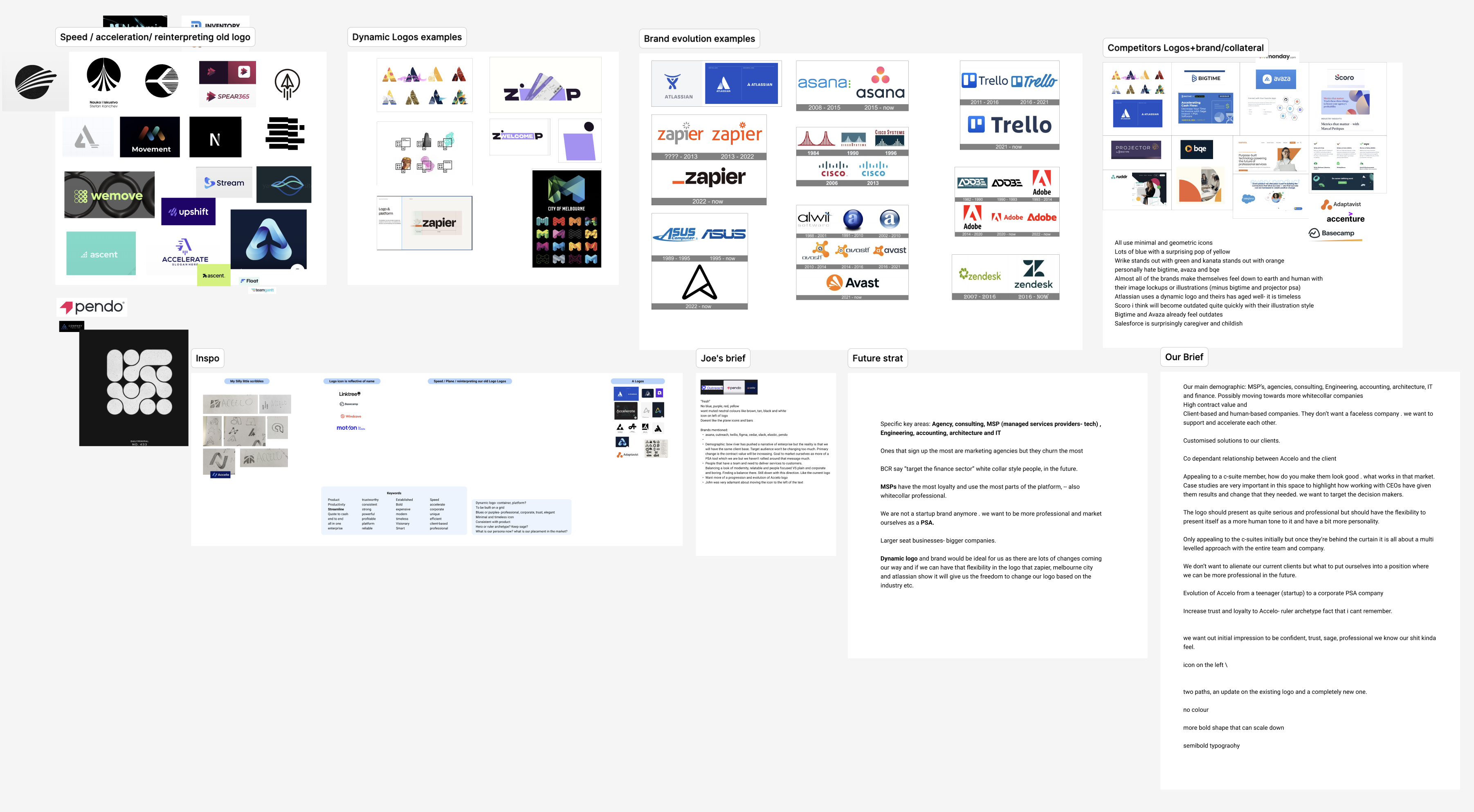
The directive from the investment firm was straightforward: develop a new logo and a refreshed look for Accelo that would resonate with a more upmarket audience. The challenge was to execute this quickly and efficiently without the luxury of extensive persona and archetype research. Our goal was to leverage existing product knowledge and previous design research to guide the rebrand.

The Approach
We began by writing a reverse brief to outline our vision for the rebrand, focusing on speed, acceleration, connection and flow as the key themes.
After getting approval on the brief, we conducted initial logo research, examining recent logo evolutions in the industry and brainstorming ideas that aligned with our themes.
Using quick sketches, we explored unique concepts and refined them through internal discussions. We developed a range of initial concepts, which were reviewed and iterated upon, ultimately favouring a design that incorporated movement and momentum.
Initial brainstorm and reverse brief construction
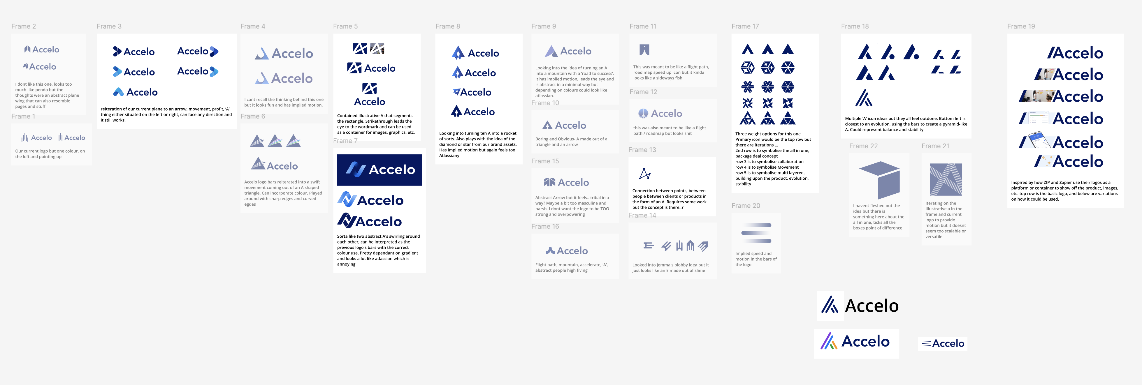
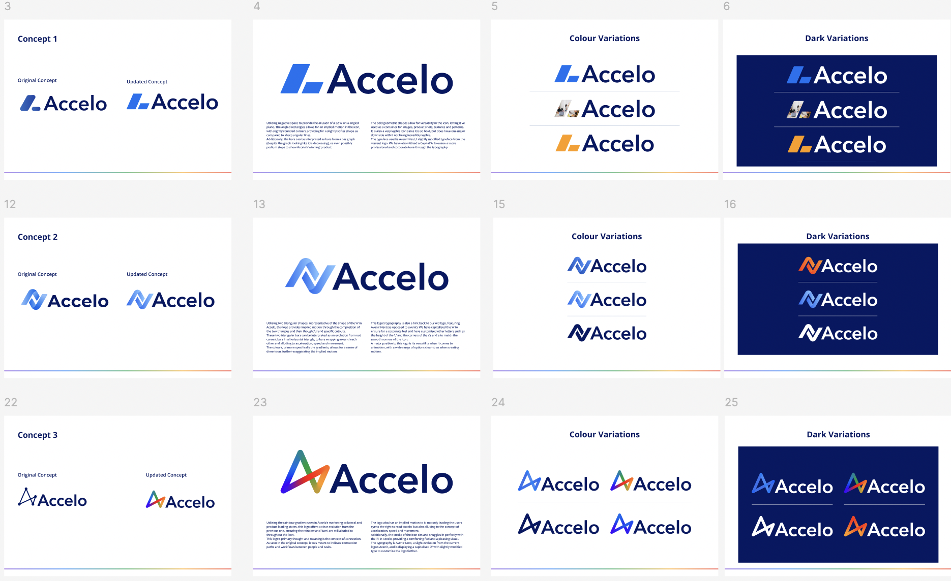
Initial Concepts
Logo Revision 1
The initial favourite was further developed, exploring different styles and colorways. Feedback led us to present multiple concepts, ensuring we had a dynamic and unique final design.
Revision 1
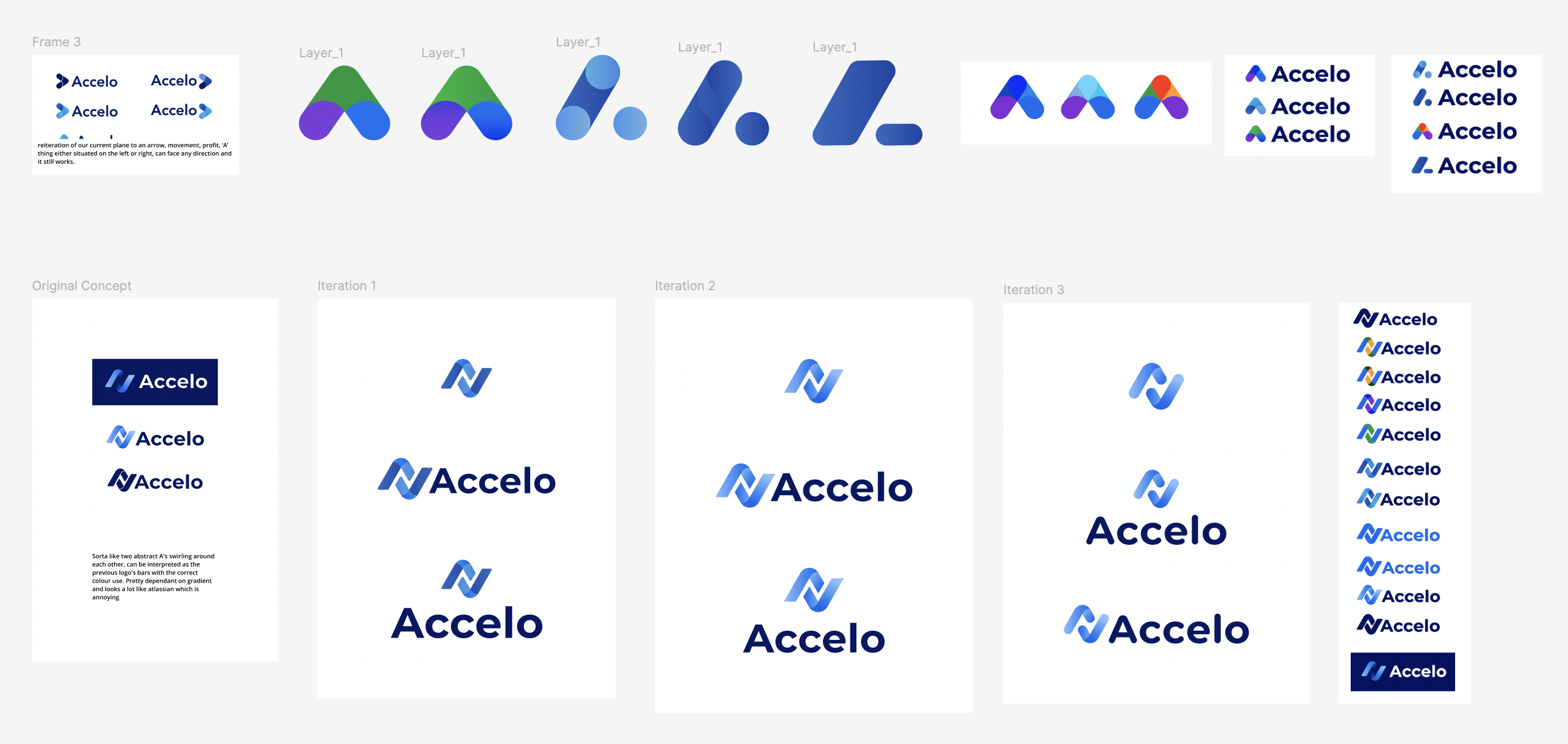
Logo Revision 2
Concept 1: In this round of revision a safer and more corporate concept was created, in order to balance out the options provided.
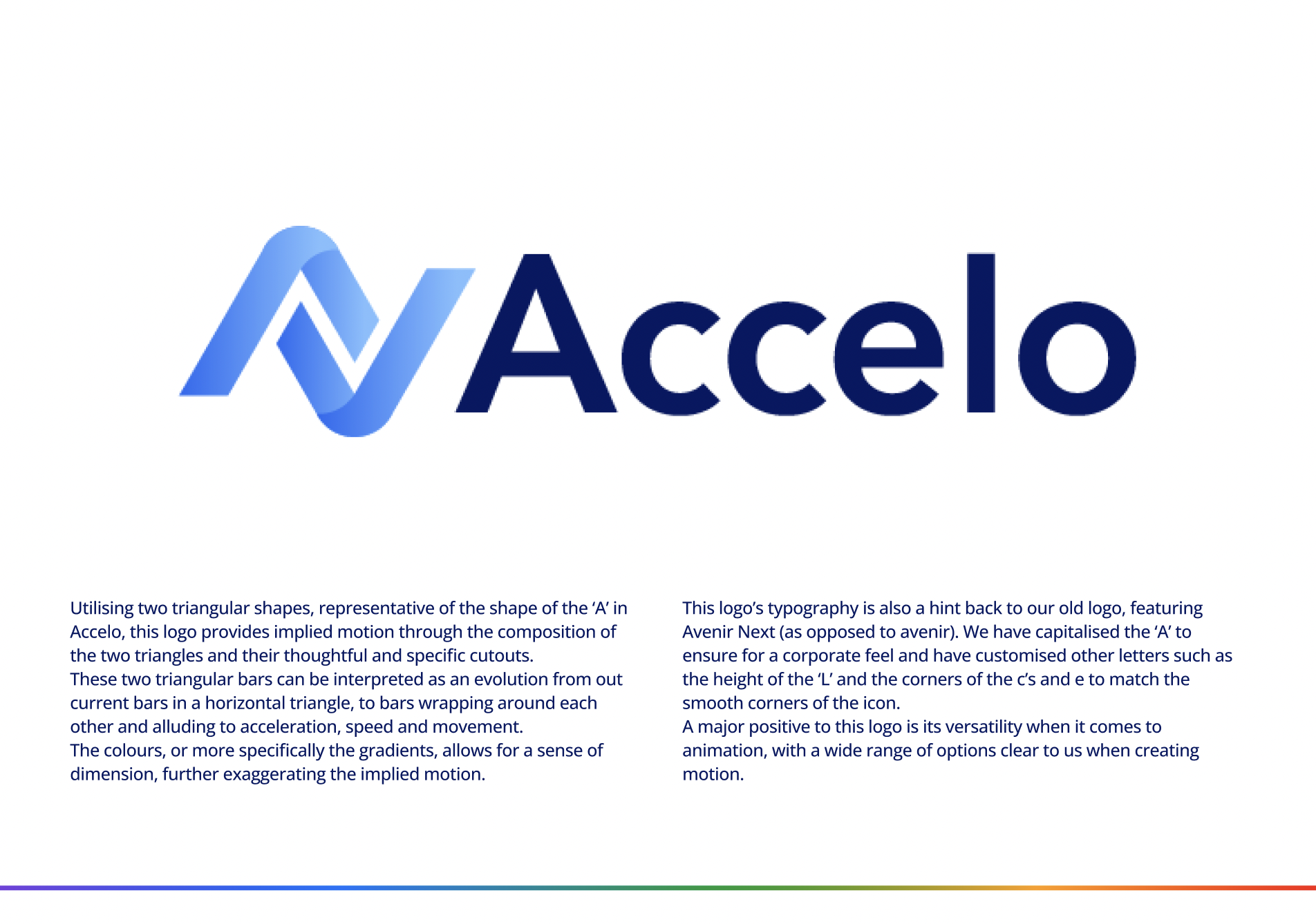
Concept 2: I had concerns this was too generic, hence additional concepts being explored. We also discovered a competitor with a very similar logo.
Concept 3: Reviewing sketches and work done up to this point, I felt like we had left something on the table by discarding the original concept. In my mind the sketch showed connectivity, communication, movement, flow, speed and agility however needed refinement to make it modern and work for Accelo.
Reision 2

Concept 1
Concept 2
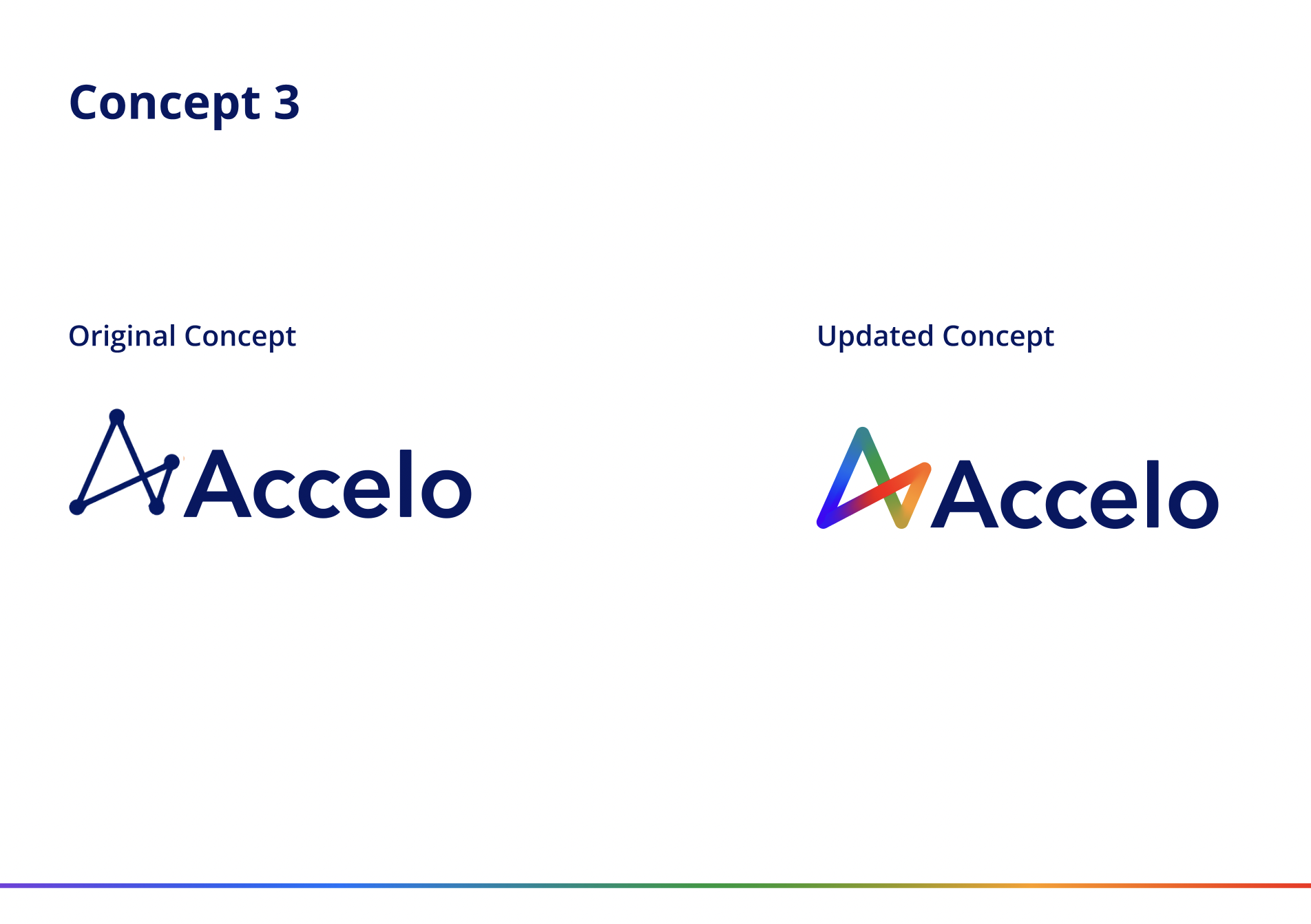
Concept 3
The Final Logo
Concept 3 was unanimously selected by stakeholders as the preferred direction and logo favourite. Stakeholders requested further colour exploration to remove the rainbow colour.
Some subtle tweaks where made to the typography, tightening kerning and additional rounding of the Capital A as the final version of the logo.
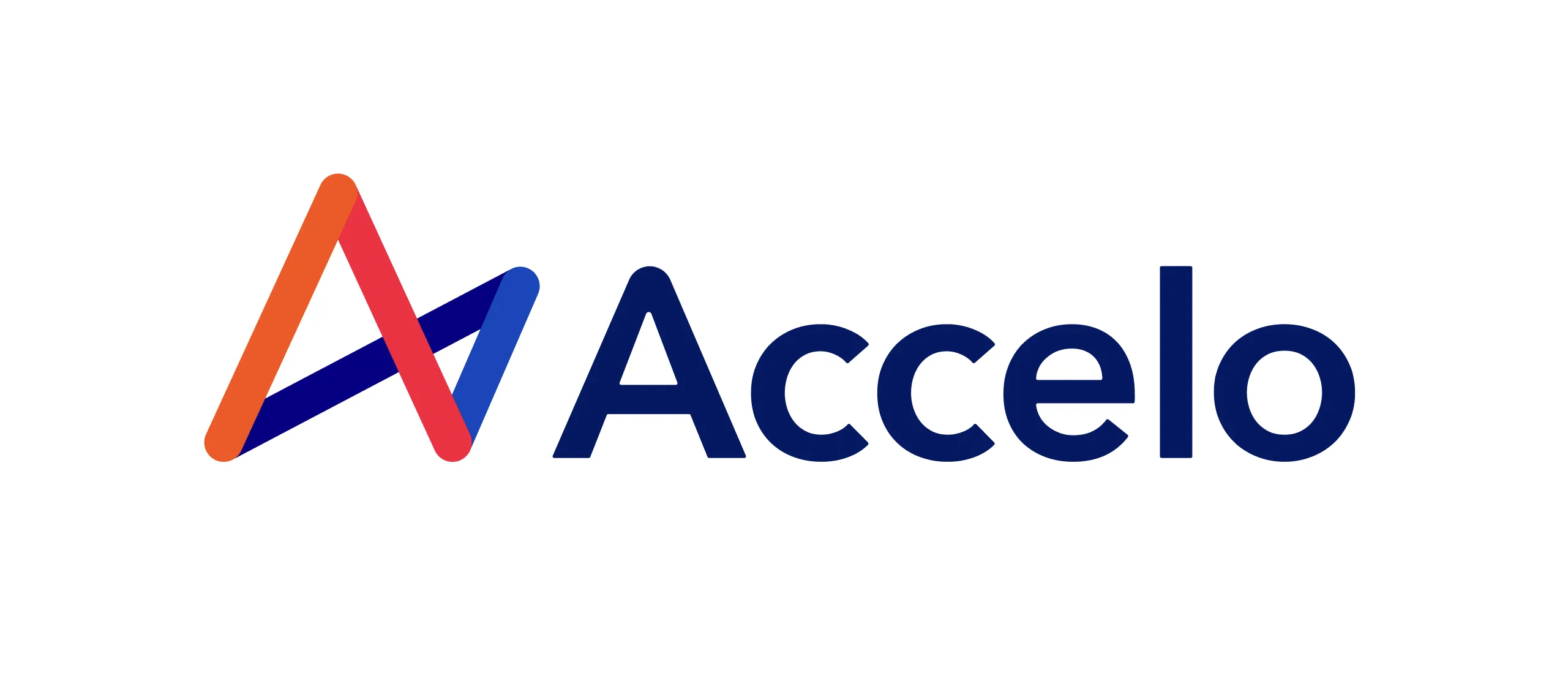
Final Logo

Logo design timeline
Website design
Accelo Website Redesign
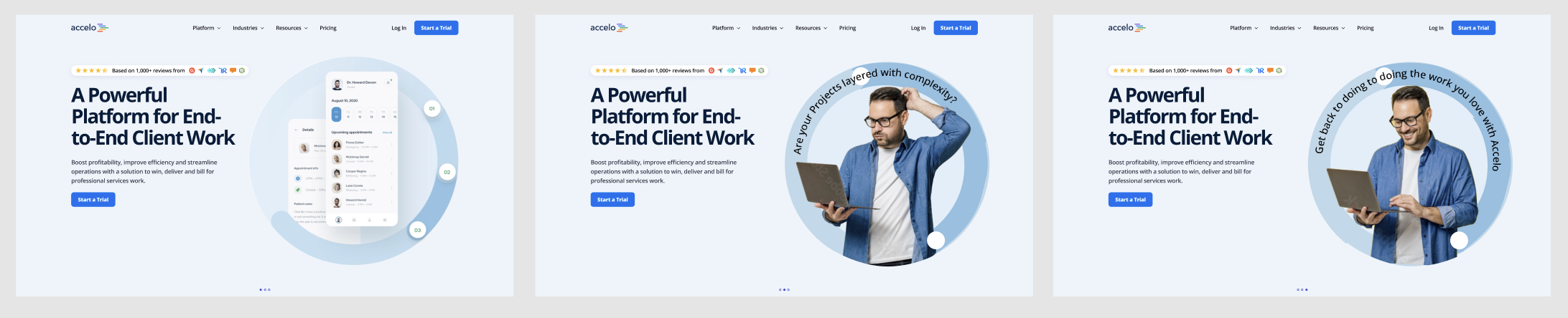
The existing Accelo website was outdated and lacked a clear brand identity. Initially redesigned by an external agency, it failed to deliver the desired results. I was asked to take over the redesign, leveraging my web design experience to create a cohesive and engaging online presence for Accelo.
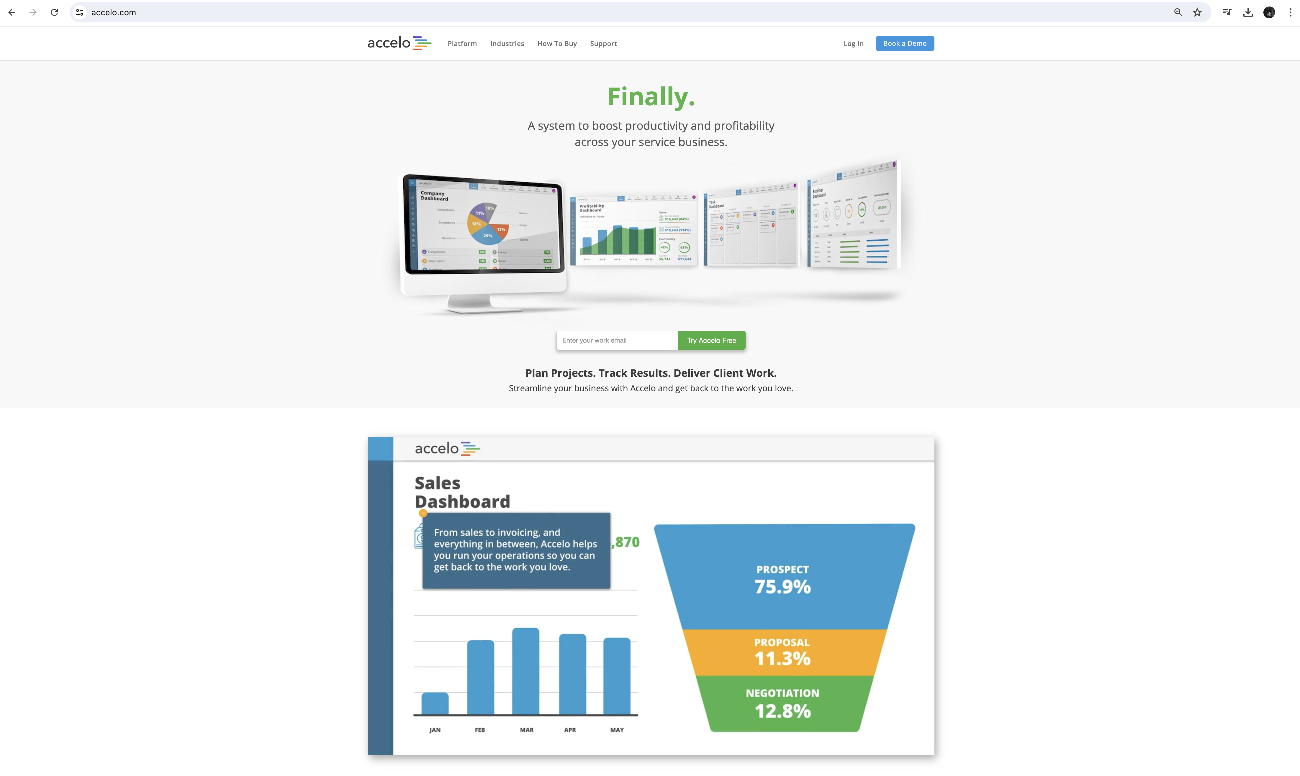
The Accelo website before redesign
Starting with the homepage, I focused on defining the look and feel, using the hero landing section to set the tone. The goal was to create a site that was approachable, friendly and clearly communicated the benefits of using Accelo. I conducted competitor analysis and gathered quick concepts to facilitate the conversation with the marketing team and CEO and find alignment on the new direction.
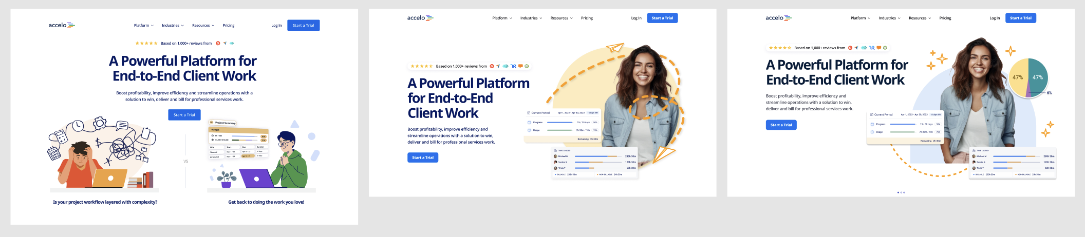
Static concpets mocked up for stakeholder discussion
Animated concept mocked up for stakeholder discussion
Through a series of iterations and feedback sessions, we refined the design, focusing on social proof, clear messaging, and a professional colour palette, with sparks of vibrancy to bring energy to the brand.
The final home page design was approved by stakeholders. While establishing this home page look and feel, the content team had collated content and prepared for review and roll out.
With the home page style and content ready, I worked with the junior designer to roll out the remaining 36 master pages for the website.
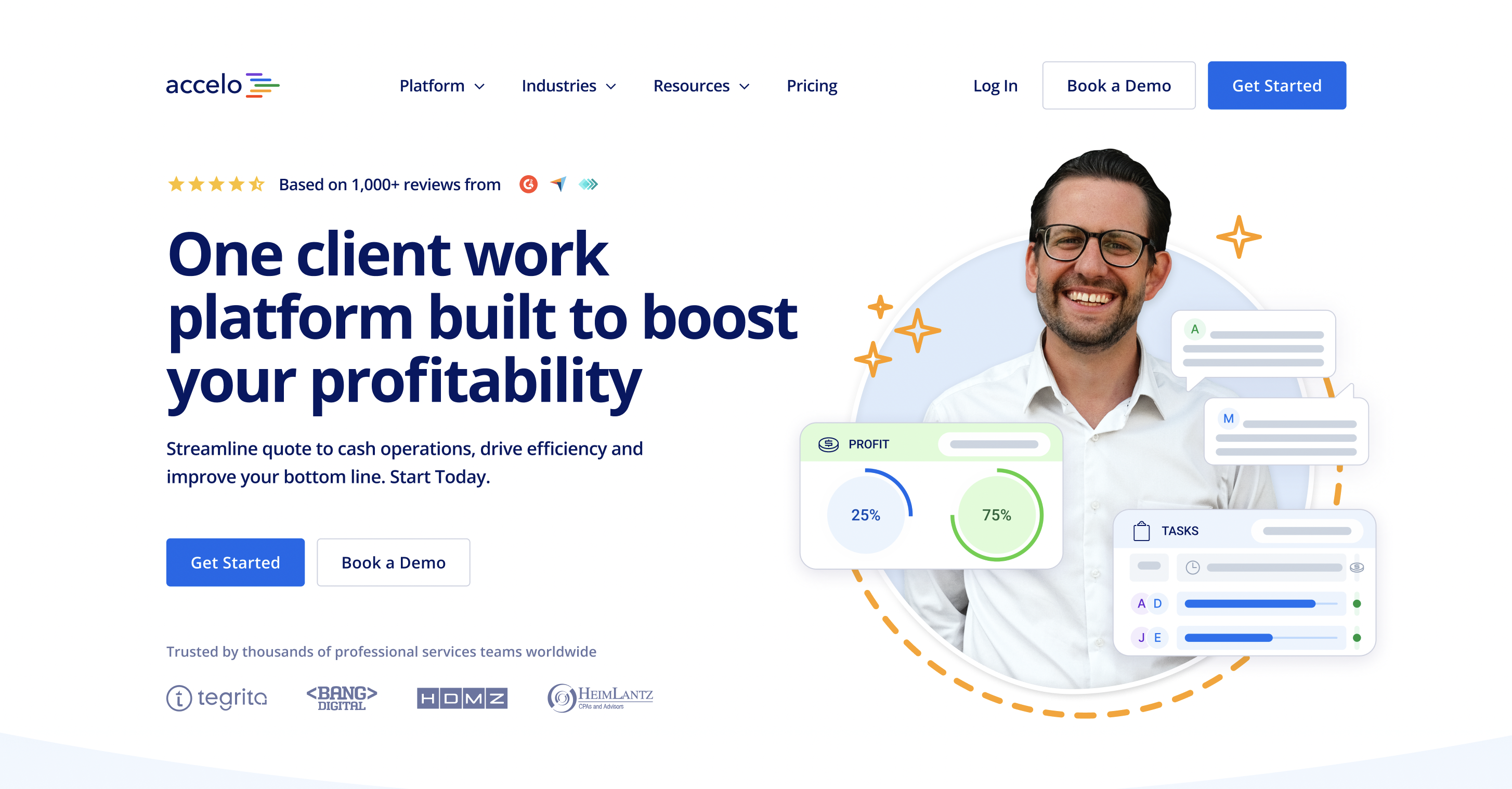
The final header concept
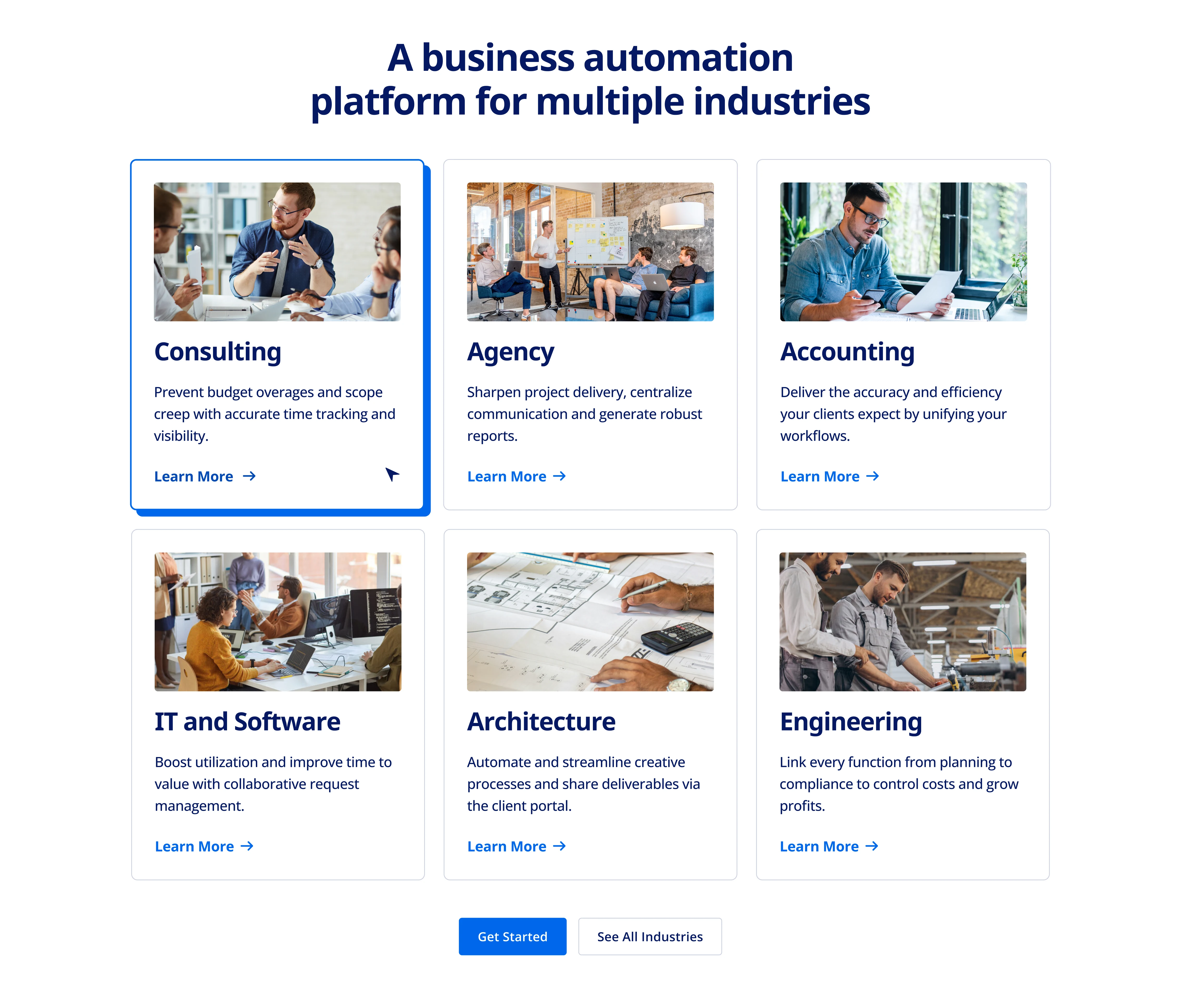
Industry Section showing hover state

Key work platform function preview including stylised product representations
The Solution
The rebrand resulted in a refreshed logo that captures movement and momentum, aligning with Accelo's mission to streamline business operations.
The new website is user-friendly, clearly communicates product benefits, and features social proof and vibrant brand elements for an enhanced user experience.
This rebranding positions Accelo to target a more upmarket audience and supports growth objectives.
I delivered the brand and website ahead of schedule while managing product feature design, new ownership and a company-wide restructure.