product design
Redesigning Accelo's
Project Overview
Redesigning Accelo's
Project Overview
After onboarding and gaining a thorough understanding of the Accelo platform, my first major project was to redesign the Project Overview screen. Project overview is hugely complex, this case study focuses on the drawer component, a leap forward in solving UX/UI problems Accelo faced with the redesign of the Product.

The old Accelo Project Overview
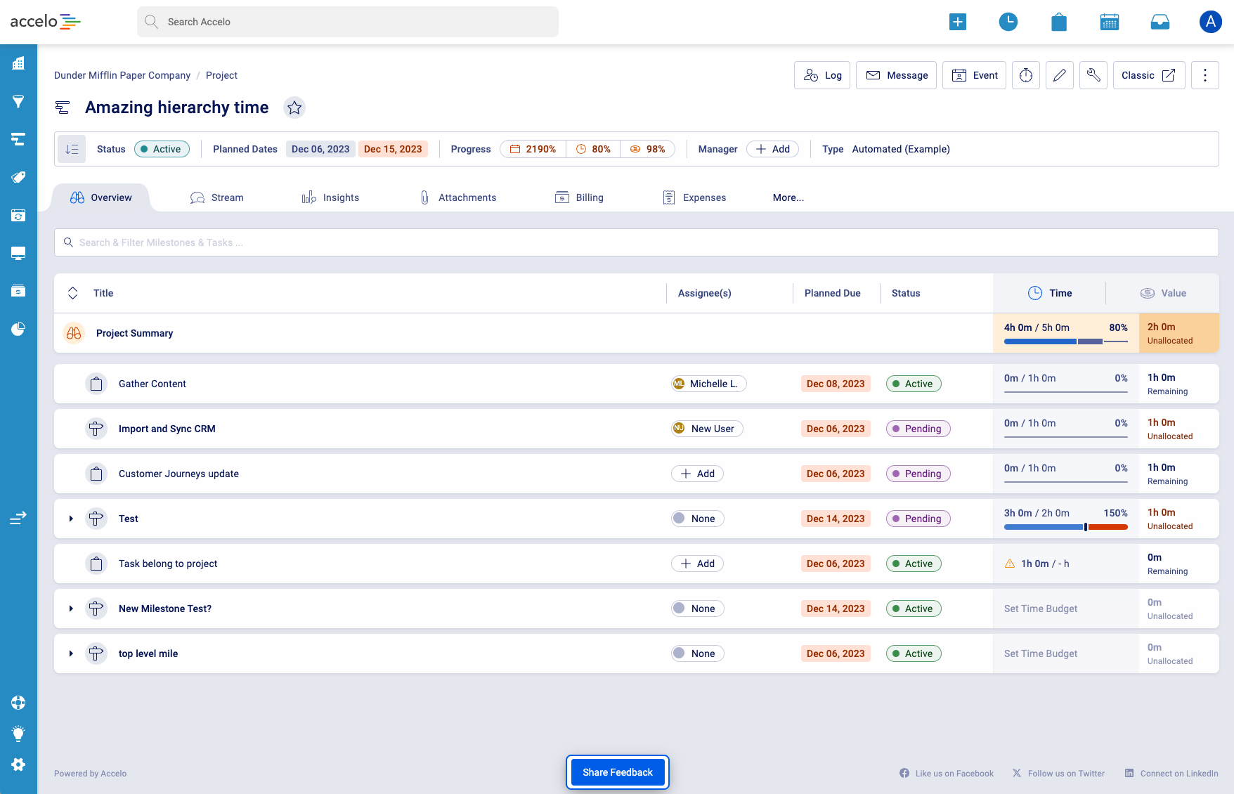
New Accelo Project Overview
Old Accelo Project Overview Vs New Accelo Project Overview
The Problem
The existing Project Overview view screen had several issues. Accelo needed to display a large amount of information for any given project, often resulting in new browser windows being opened or users being taken away from their current context. As more tabs where opened, navigation became more cumbersome and disrupted workflow.
Additionally, users needed to log time, create messages, and create events related to each item displayed in the Project table, which the current design did not handle efficiently.
- Manager Persona: "by the end of the day I have scores of tabs open that Accelo has opened why does it open so many tabs???"
- Individual Contributor Persona: "The product can be overwhelming, SO much data is shown and not all helps me do the work I need to do"
- Business context: We need to show a lot of data in a small space for a huge amount of objects. We want a powerful system with controls hidden away. We don't want to overwhelm Individual contributors, but have the functionality that power users are looking for.
The Approach
To address these issues, the design team began by reviewing a detailed requirements document from the Product team, ensuring we fully understood the features and sub-features needed. We conducted internal interviews with product experts to identify the biggest pain points with the current view screen.
A major issue identified was the excessive use of new browser windows, causing users to lose context.
I proposed the implementation of a drawer system during a product design call. This design pattern would allow users to interact with additional information and actions without leaving the current page, thereby maintaining context and reducing the need for multiple open tabs.
After initial approval to explore the concept, I researched similar implementations in other platforms, such as
Craft.io and confirmed that this pattern could work effectively for Accelo.
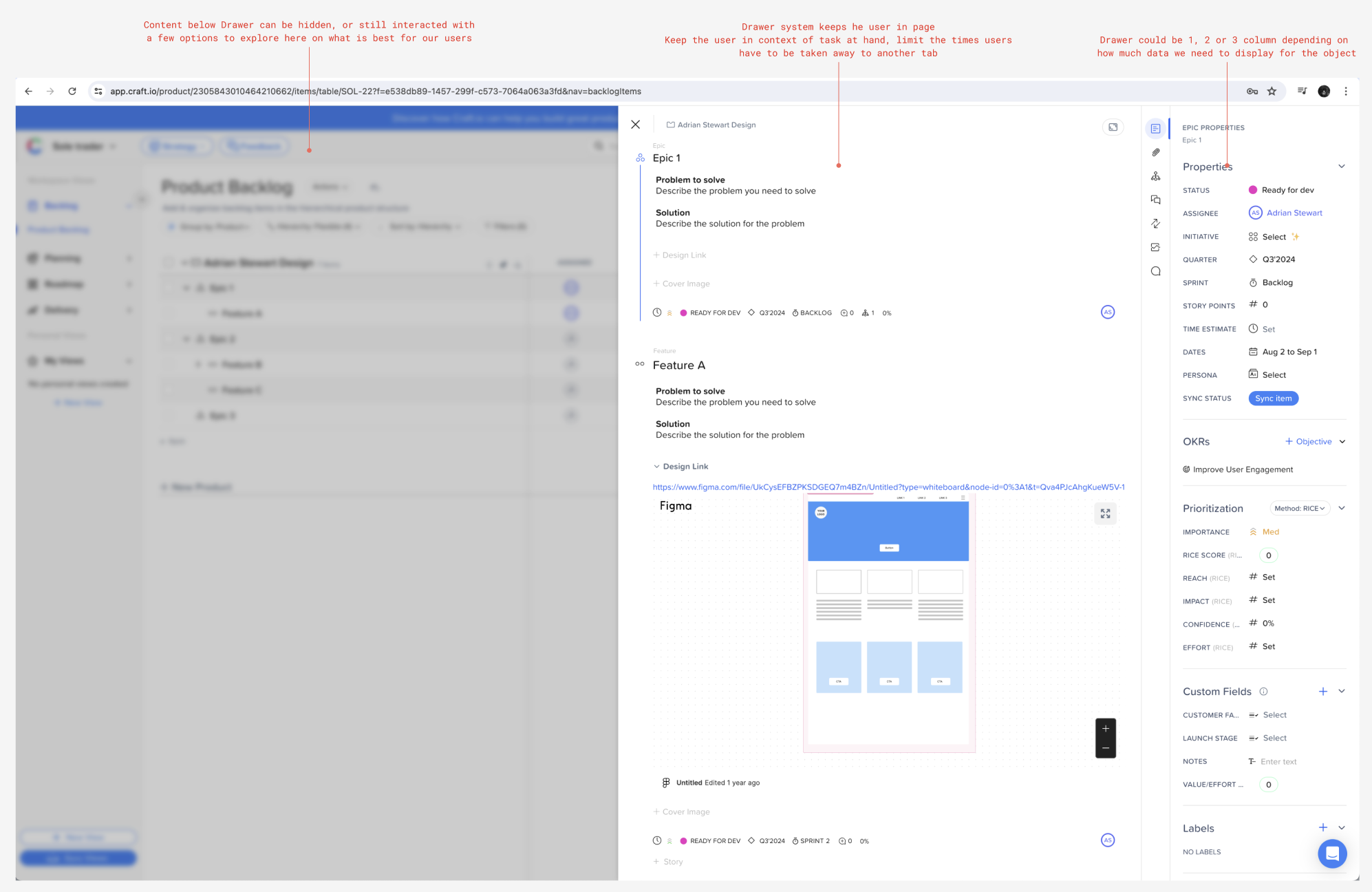
Competitor analysis notes
The Solution
The first implementation of the drawer was the Project Summary Drawer, which provided users with instant insights into the project's status, such as being on track, in danger or over budget.
The design team worked through iterations of the drawer to ensure ultimate ease of use and functionality expectations were met.
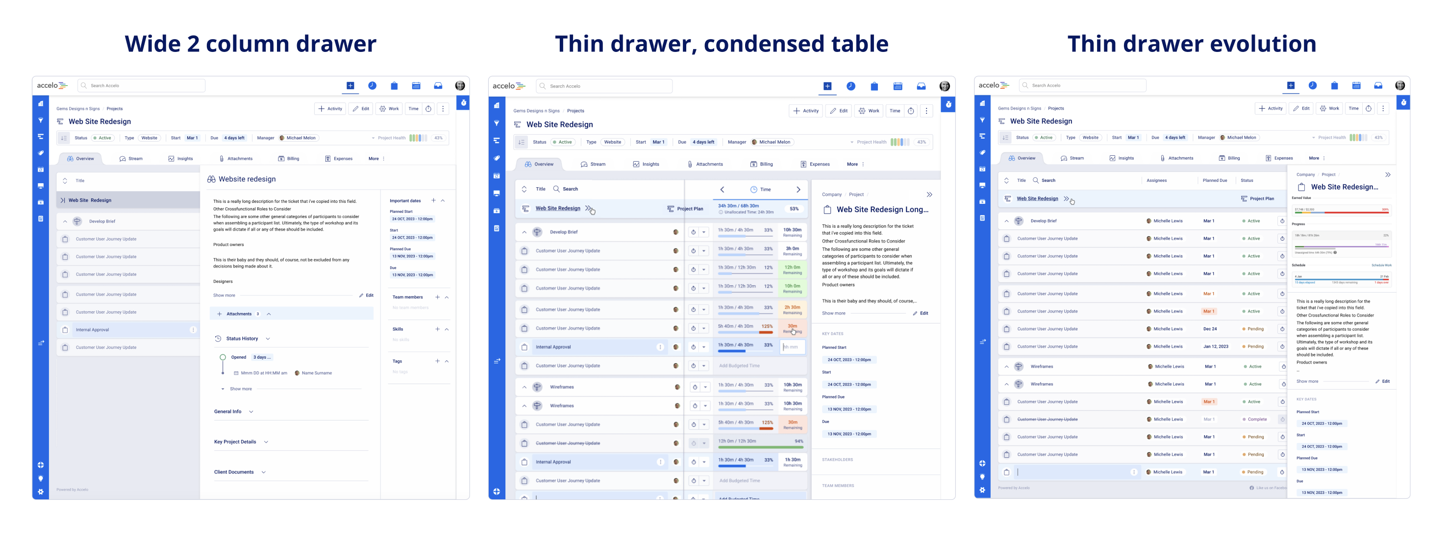
Drawer design and functionality exploration

The final iteration of the Project Summary Drawer, showing warning sentiment
This design was approved and became a key part of the product redesign. The drawer concept allowed users to log time, create messages and create events without leaving the current page, thus improving efficiency and maintaining context.
The drawer system then became a highly utilised pattern within the Accelo product redesign.
A guide was written detailing when and how drawers should be used. This pattern was integrated across various features, allowing for seamless interaction with complex data and multiple primary actions. Overall, the drawer system significantly improved the user experience by keeping users focused on their tasks while providing necessary information and controls in an accessible manner.
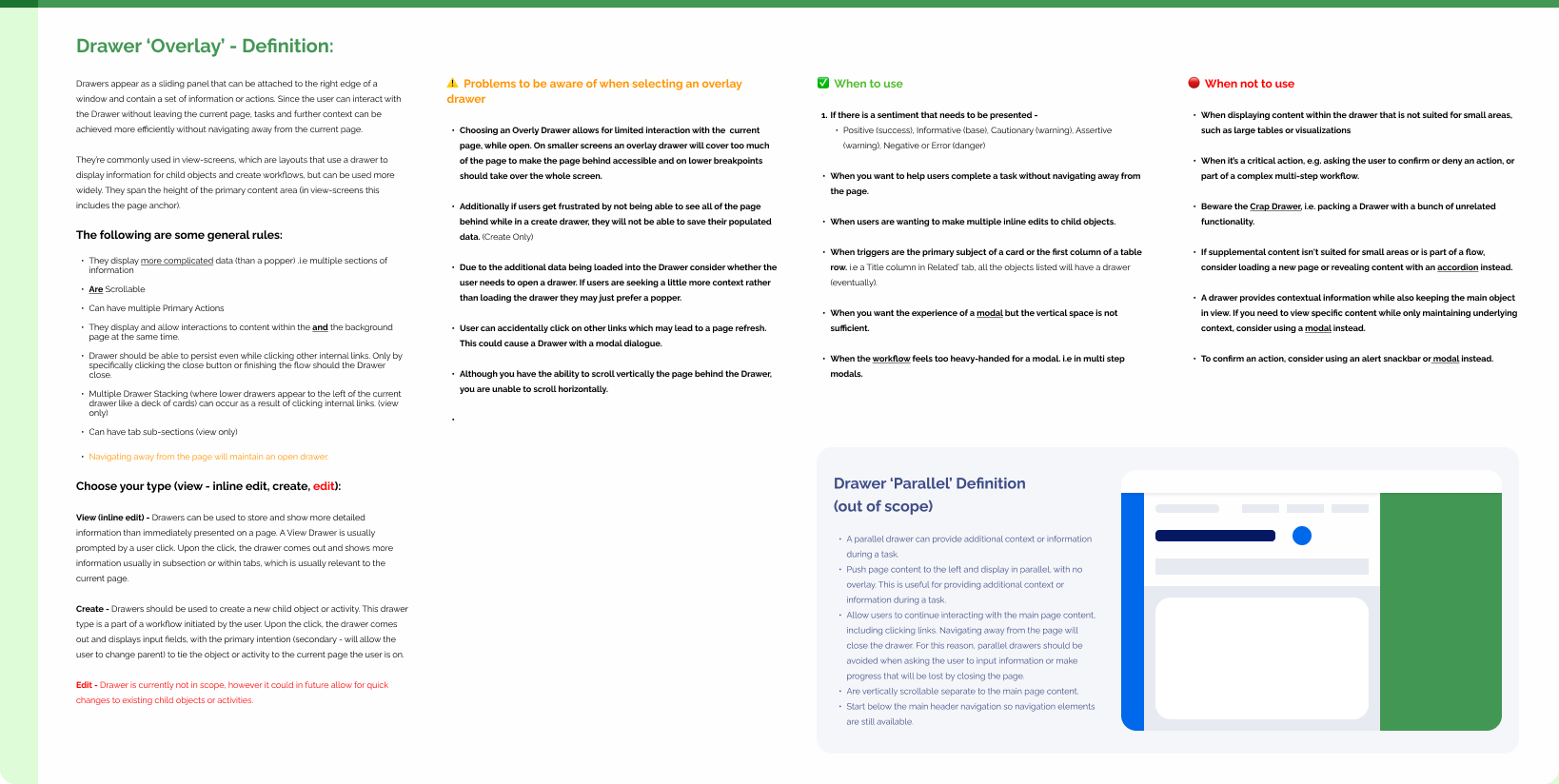
Drawer definition and documentation
